.png?width=700&height=127&name=Blue%20Mantis%20formerly%20known%20as%20SME%20Solutions%20Group%2c%20Inc.%20(GREEN).png "Blue Mantis formerly known as SME Solutions Group, Inc.")
Hospitals need to be looking at a complete 360-degree view on admissions to minimize readmission occurrences which drive higher costs and lower patient satisfaction.
In this case study, we will be walking through a use case that SME and Vizlib Legend George Barrett developed for a private community healthcare system that serves 16 counties between two states. The hospital consists of a 750+ bed acute care facility, multiple specialty care centers, residency programs, over 30 affiliated physician practices, and partnerships with universities and other hospitals.
While this was developed for a particular hospital, this is a very pertinent use case that can be applied for really any hospital and has also some implications in the healthcare field.
This case study focuses on how SME was able to utilize the power of Qlik Sense and the extensibility of Vizlib to bring a dashboard to life. This case study will also provide tips and tricks on how advanced data solutions were able to save the hospital’s developers an average of 20 hours a week to focus on new initiatives and retire previously used reporting programs to save $80K a year.
The pain point, the goal, and the data behind the scenes
The hospital collected data across multiple systems for its patients, admissions, and discharges. However, the readmission rate of patients could not be tracked using their traditional reporting tools and medical systems. Readmissions were one of the most important, if not the most important, KPI for a particular department and the amount of effort to wrangle the data to create ad-hoc reports led to months of repetitive work and was prone to errors. This was due to the complexity of the underlying data and a lack of understanding of how it could be modeled correctly.
This department wanted to create an analytics application that visualized the readmission rate and frequency (same day, 1-7 day, etc) of its patients. Working with SME, they implemented Qlik Sense to automatically extract the data out of the databases and medical systems, model and transform the data to turn raw admissions into a historical readmissions view and create an associated series of dashboards designed exactly to the stakeholder’s prototypes.
Goal-focused KPIs
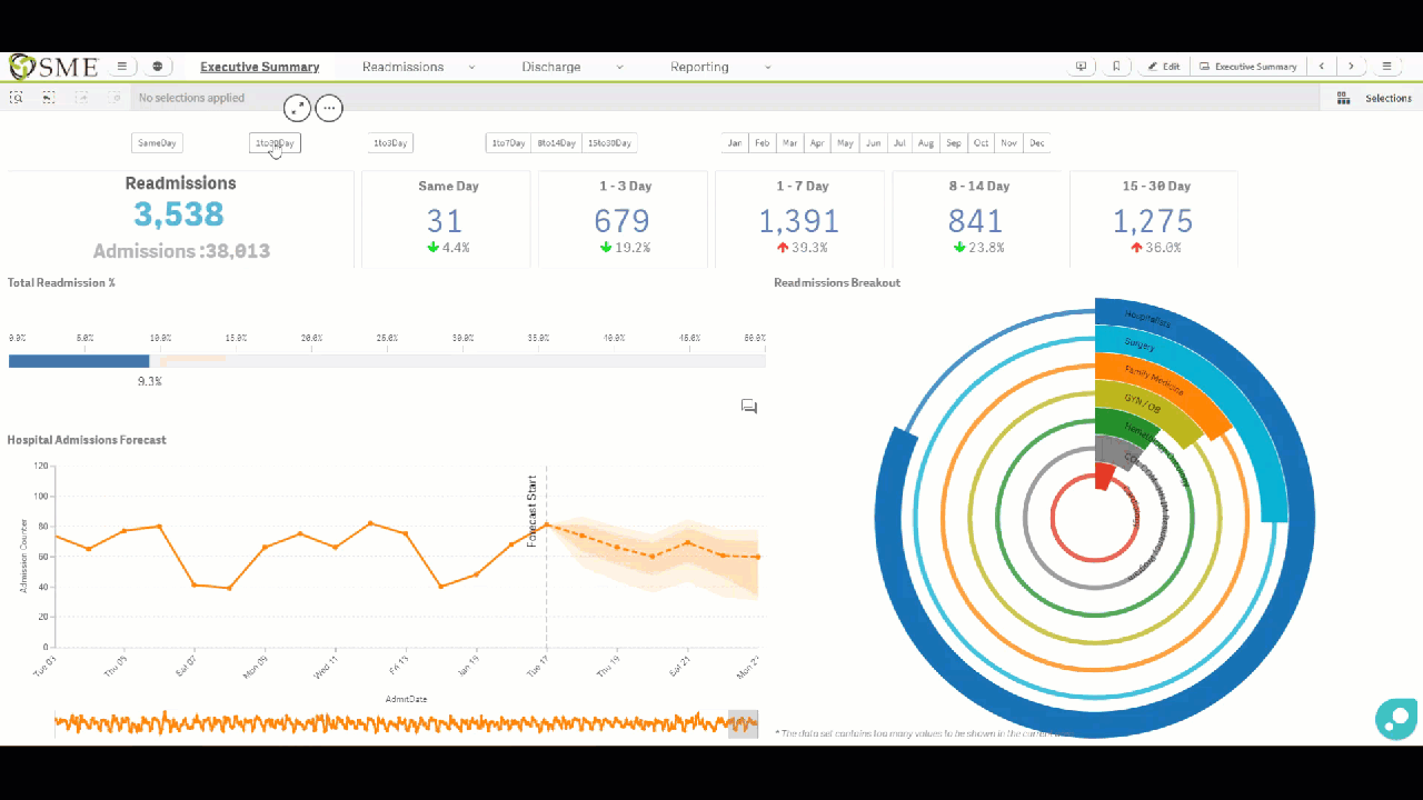
The executive dashboard was developed as part of the 360 Admissions application to provide the highest-level view of the readmissions and look at specific targets or key performance indicators (KPIs). The goal was to minimize the number of readmissions for this particular hospital by tracking the following KPIs:

- Readmissions occurring on the same day as the index admission
- Readmissions occurring 1-3 days, 1-7 days, 8-14 days, and 15-20 after the index admission
- The percentage change over time for each of the above
Right off the bat, these KPIs were very useful for the hospital. Their previous tools were not able to achieve this because of the data modeling, but Qlik’s associative engine allowed us to do that with relative ease and Vizlib’s KPI Designer enabled us to format the KPIs in an easier to consume way.
In addition to the KPIs, the dashboard includes:
- Readmissions are broken out by the practice, like Cardiology or Hematology.
- Forecasted hospital admissions by the day.
The dashboard can filter down information, using the Vizlib Selection Bar at the top of the application.
For example, a user can easily and quickly filter the data to look at just 1 to 30 day readmissions. This filter results in a new representation where the KPI's, activity gauge, and forecast all update. This was found to be extremely powerful, specifically for forecasting,
The 360 Admissions application was developed to update on the fly and with the end-user in mind, meaning it needed to be organized and easy to navigate through the data to improve the speed of decision making.
From visualizations to insights, and reporting
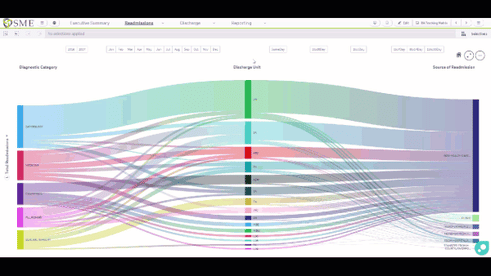 Vizlib Sankey Chart was implemented to display the end-to-end Readmission cycle, including how the patient was originally diagnosed, where the discharge unit was, and the source of readmission. This particular visualization was valuable because they were able to unearth trends and patterns in an end-to-end cycle.
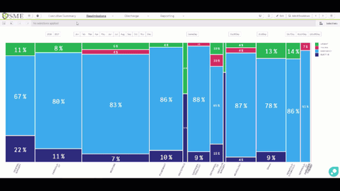 Vizlib Mekko Chart was used for visualizing the matrix of the patient admission type and the readmission service line. The added value of this visualization is to see the breakout of whether the readmission was an emergency or fell into the elective, urgent, or trauma categories. When utilizing this, your eyes are able to use comparative data analysis without even having to see numbers, reducing the time it takes to analyze the data. In this use case, the end-user performed a quick analysis without having to dive into the weeds and saw that Cardiology posed the greatest risk of Emergency readmissions within the 8-14 window.
Improved reporting was a key initiative for this use case. The hospital had a strategic goal to increase the use of ad hoc reporting and enhance communications between different team members.
Under the reporting folder, an ad hoc section was created to allow users to go in and essentially create their own charts in a guided and governed manner without needing a highly technical skillset. Under the note-taking section, users can provide notes in context to the visualizations they are looking at without leaving the 360 Admissions application. Using Vizlib Input Form and Teamwork they are able to communicate more effectively with team members regarding specific dashboards, sheets, visualizations and provide in context notes right here within Qlik.
As with the executive dashboard, everything is responsive and can be drilled down to the right information, for the right person, at the right time.
The business impact
SME’s 360 Admissions application was designed to be an all-encompassing analytics solution for the hospital that brought various data sources together for easy analysis which required bringing in demographic data and discharge data. We pulled in data like home state, gender, age bracket, insurance type, discharge units, and discharges by day of the week. The goal of using this data was to see what is happening inside of the hospital where units are seeing more readmissions and maybe diving in and figuring out if there is a common trend or something that we can do to improve and work towards the end goal of reducing the number of readmissions and taking a patient-centric approach.
Upon deployment of the readmissions solution, it was met with widespread acclaim across the department and its stakeholders. The ad-hoc reporting was streamlined, saving the developers an average of 20 hours a week to focus on new initiatives. The department also retired the previously used reporting programs, saving them $80K a year. With the increased visibility into how readmissions are tracked to certain diagnoses, discharge units, and admission facilities, the hospital was confident that they could attempt to minimize readmissions percentages by up to 10% in the first two years.
To see a demo of this healthcare analytics use case or one in your industry, email us at info@smesgroup.com.
"Nothing is more satisfying than successful collaboration between partners and products to deliver value for a customer."
-Christopher Moyer, SME Solutions Group